Content Style Guide
About This Guide
This is a reference for anyone that writes (or is interested in) content for Technical Safety BC’s digital properties and assets. This guide will help you to understand our principles and tone to write clear, simple, and action-oriented content. While this style guide is oriented towards digital, many of the principles and standards apply to offline communications as well.
If you’re writing for Technical Safety BC, it’s because you’re a communications or subject matter expert that’s been asked to support our work. It’s a pleasure to have your help and we hope you can use this style guide to check that your writing is on brand, consistent with other assets, and supportive of our values.
This guide will help you write content that is:
- true to our value of making the complex simple;
- easy to read and understand;
- clear and precise;
- able to solve a user’s problem and provide clarity on their next steps; and
- clear and digestible for employees, clients, and stakeholders.
About Us
As the regulator of technical systems within British Columbia, our role is to help educate our clients, and the general public, about the safety system and the critical role they play within it. We are an independent, self-funded organisation that oversees the safe installation and operation of technical systems and equipment.
In addition to issuing permits, licences, and certificates, we work with industry to reduce safety risks through assessment, education and outreach, enforcement, and research. We enforce compliance with standards to ensure consistency and fairness, and we conduct assessments, particularly in high-risk situations.Principles
People come to our site or look to us to find information about a question or problem they have. By applying the principles below, we can help educate them, and provide them with the next steps, along with any additional information they need.
Making the Complex Simple
We untangle complex systems and technologies to make it easy for our clients to understand how to operate within the safety system. We do this by:
- removing jargon;
- providing clarity on what is required and the reason why; and
- educating our clients on standards and procedures they need to follow and making it clear what the next steps are (e.g. when and why a permit is required, why and how an individual needs to be certified, and the requirement and process to obtain a contractor licence).
We also help educate clients and the public on the safe use and operation of technical equipment from ski lifts to elevating devices. This is done through safety stories that educate the public on why safety is important and how to act with safety in mind.
Easy to Read and Understand
- We understand the audience we are speaking to and what we are trying to convey.
- We remove the jargon and acronyms from our writing so people understand what we are talking about.
- We use headers and headlines to distinguish important information, along with bulleted lists to help users scan through information to find what they are looking for.
- We provide supporting/related information to ensure the reader has the full context.
Clear and Precise
- We avoid verbose sentences.
- We ensure the information is accurate.
- We use lists and steps so people know what to do, in the correct order.
- We have clear calls to action via links and buttons so it’s obvious what action the client should be taking next.
7 Signs You’re Doing it Right
This is a best practice guide of things to think about when you’re writing for any of our content properties. Treat it like a checklist.
Keep it Simple
We want people to read our content so keep it simple and factual. Use plain language, and avoid jargon and confusing words.
Write for a Grade Eight Reading Level
This helps people with literacy challenges, disabilities, and English as a 2nd, 3rd, or 4th language. Even technical specialists prefer to read plain English as it’s easier to understand and faster to read.
Keep it Brief
People skim content and look for cues like headers, bulleted lists, and calls to action. Ask whether all the content needs to be there. If it’s redundant or repetitive, reduce or remove it. Get to the point and don’t bury the content. Tell users what they need to know, and do it towards the beginning of your communications.
Be Consistent
Use this guide and any available templates to create a consistent tone, style, and format. Don’t change the way you write from page to page or within a page.
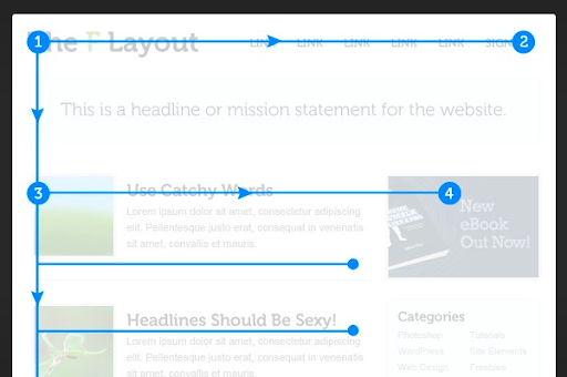
Write for the Screen
When you are writing for digital remember that the web is not like a book. Users can search and land on any page on the site. They don’t start on the homepage and there is no end page.
Try to provide cues for users to skim to (headings, lists, calls to action) and remember that users scan a page in an F shape pattern — across, down the left side, across, down.
Don’t Bury the Content
Use the inverted pyramid model where the most important information is at the top of the page, supporting material is in the middle, and the least important information is at the bottom.

Write for a Purpose
People come to us for help and our job is to provide them with the information to make a clear, informed, and confident decision.
Tone
Persona: The Advisor
While we are the regulator, we provide helpful and practical information for contractors, homeowners, building owners, and the general public to take notice of and act upon for the safe use and operation within the safety system.
Tone of Voice
How we write reflects our brand. We use four principles to guide our writing:
1. Clarity
We make it clear as to why something, e.g. a permit, is required and the process to obtain it. The safety system is complex so we avoid jargon to make things easily understood.
2. Informative
We are confident in the information we provide and the need for it to be read and understood. We provide the right information to help answer a client's question/problem and we avoid unnecessary words.
3. Inclusion
We are creating a safety system that is respectful of all British Columbians and our language reflects that.
4. Genuine
What we say impacts lives and livelihoods within the safety system. We write with conviction as our message is important. We write from a position of expertise without being superior.
Perspective
- Use first person – “We”– content in the first person helps to create a sense of intimacy with the reader, making the content feel more authentic and personable than other perspectives. This is often effective on social media or in more colloquial forms of blog posts.
- Use second person – “You” – writing is typically more active and engaging and speaks directly to your audience. This is great for anything that involves a call-to-action such as web copy and blog posts.
- Third person – “he, she, they, it” – is best used for establishing authority or when talking about an external party. While there are times you will need to use third person while writing for Technical Safety BC, it is less common than first or second person perspectives.
Readability
Active Voice
We use an active voice to create confidence and assurance, e.g. You will need the following vs. Sometimes you might be required to provide the following. The active voice removes ambiguity, uses fewer words, and focuses on the task required.
Age Level
We write for Canadian Grade 8 (age 12–13) level comprehension. Readability helps everyone, including the experts. This helps people better understand information and ensures they know what they need to do to complete a task.
Directed at the User
We speak to our users, not at them (use "you"). E.g. You can call us at …. vs. For additional information contact one of our specialists at …
Content Structure
Our Name
Our name is Technical Safety BC and is sometimes abbreviated to TSBC when space makes it necessary. In a URL or email address we use lowercase technicalsafetybc.ca.
Terms We Use
- We are an organization, not a company or agency.
- We have employees, not staff or workers.
- We have safety officers, not inspectors.
- We have clients and partners, not customers or users.
- We charge fees, not prices or costs.
Tagline
- Safe Technical Systems. Everywhere.
- This is also our vision and should be written in title case.
- It should NOT be bolded, italicized, or put in quotation marks.
Font
We use Inter as the font for our digital properties. Inter is used for headings and body copy. It is a Google font so will work in any browser. Inter is a typeface carefully crafted & designed for computer screens. Inter features a tall x-height to aid in the readability of mixed-case and lower-case text.
When creating a presentation deck or long-form document/email we use Arial as the secondary font. Please only ever use the Technical Safety BC deck supplied by the marketing team for presentations.
Case
We use title case for headings, sub-headings, and call to action buttons.
We do not use title case for technology names e.g. elevating devices, or department names — marketing and communications, unless it is used as part of someone’s title (e.g. Amelia Earhart, President of Aviation).
Capitalization
We do not use all caps in headings or any body copy. Capitalization is part of the digital style guide and is only used in cards for the overline name.
Bold
We use bold sparingly as it is interpreted differently by screen readers and is difficult to read for those with dyslexia.
Italics
We do not use italics — anywhere. This includes titles and acts. Again, this follows best practices for accessibility.
Headings
We use headings to help readers scan for information. Headings should be:
- clear and descriptive (this is the important information users are looking for);
- 60 characters or less;
- written in an active voice;
- optimised for search engine optimization; and
- void of dashes or colons and do not include a period at the end.
If you are unsure which words your heading should be title case, try plugging your heading into this useful title capitalization website.
Heading Structure
- Headings help both users and search engines identify the most important information on a page.
- The H1 heading is the most important and is used for the banner heading. This is often the page title.
- H2 is used for second-level headings on category landing pages, e.g. Amusement Devices or Permits.
- H3 is used for headings on product pages, e.g. Electrical Permits or Amusement Device Design Registration.
- H4 is used for card headers.
- H5 is not used.
- H6 is used for accordion headers.
Links
Inline links indicate that the user will be taken to another page, a document (e.g. PDF), or an external website. Links should be in lowercase.
Underlining
Underlining is only used for email addresses and inline text links that link to other sections of the website or other websites.
Lists
We use lists to break up large amounts of information into more scannable bite-sized chunks. Lists can use either bullets, numbers, or letters, but should contain more than one and less than seven items.
Periods and Capitals in Lists
- If a list is made up of complete independent clauses (sentences), as this one is, each bulleted item should start with a capital and end with a period.
- If the list is made up of short, independent items (e.g. a list of our technologies) not connected by “and” or “or”, then no punctuation is required at the end of the bulleted items.
- If the list is made up of dependent clauses that conclude with “and” or “or”, these are not capitalized. They should have a semicolon after each item and the second to last item should have “and,” or “or” after the semicolon and the final item ends with a period.
Bullet, Number, and Letter Style
- In some cases we may need a nested bullet list. These instances should be rare, as they can make lists look quite long and less scannable. Use this only when the primary bullet has critical sub-elements to it that can't be restructured.
- If you are writing web content, the bullet style is determined by the digital style guide. If you are writing content for other mediums, use filled, circular bullets for primary bullets and unfilled, circular bullets for sub-elements. Do not use dashes.
- Use a bulleted list where there is no order of importance, priority, or chronology and a numbered list for items in a series to indicate priority or sequence.
- Use lower case letters when using letters for lists. Do not mix letters and numbers.
- After a number or letter, use a period, rather than a bracket, and ensure you stay consistent in terms of formatting (and indentation) throughout your document.
Numbers
When writing blog or news articles we use the numeric style, e.g. 5 vs. written five within the title and headlines. In the body copy, we use written style up to the number nine. Beyond that, use a numeric style.
- We use arabic numerals. Do not use roman numerals within copy, lists, or headers.
- When writing a time use a single space and no period, e.g. 5 pm.
- When writing a date we use day, month, year and commas, e.g. Monday, December 15, 2022 or December 15, 2022. Do not use "nd" or "rd" after the day and do not use superscript.
Dates and Times
- Lowercase am am and pm and never use periods or spaces. I.e. 9pm vs 9 p.m.
- Use noon or midnight vs 12 noon or 12 midnight (which is redundant). Similarly use am or pm rather than saying "in the morning" or "in the evening."
- Use a colon to separate out minutes and hours. I.e. 3:30pm vs 330pm
- Do not add any superscript or letters after a date I.e. May 4 rather than May 4th or May 4th.
Units of Measure
We use the commonly used technical abbreviations for units of measurement:
- 50,000 Btu/hr
- 40 Amp
- 750 volt
- 221 kW
- 23,000 square metres or sq. m.
Note: always include a space between the number and unit of measurement, e.g. 20 Amps.
Buttons
We use title case for button names, e.g. Learn More.
URLs
We use lowercase for URL addresses, e.g. technicalsafetybc.ca. We do not include HTTPS or www in the URL.
Punctuation
Brackets
If brackets are required we use round ( ) brackets.
Exclamation Marks!
Nope, we do not use these.
Quotation Marks
Where quotation marks are used we use the double marks, (e.g. “ “). Generally speaking, remember that punctuation should always go inside the quotations (the above being an outlier as it is a sentence about the quotation marks).
Commas
We use the Oxford comma (also known as the serial comma) when listing multiple items. It follows the second to last list item preceding an "and", or "or".
Titles
We do not use capitalization when referring to our team in a sentence (e.g. We are looking for a vice president of marketing and communications), however, when referencing someone specific, we use title case (e.g. Kate Baillie, Vice President of Marketing and Communications).
We do not abbreviate titles, e.g. safety officer should not be abbreviated to SO.
Dashes
We can use a dash in certain circumstances but do not overuse them. Often a sentence can be broken into two vs. relying on a dash.
- A dash can be used to: attribute a quote, e.g. This above all: to thine own self be true — Polonious.
- Dashes can be used when commas may create confusion, e.g. Two contractor groups — gas and electrical — were consulted.
- They can also be used to offset mid-sentence lists with commas, e.g. The team visited several cities — Fort Nelson, Kelowna, Prince George, Kamloops — to gauge the level of interest in remote assessments.
- An em dash — is used to break up sentences and replaces commas, colons, and semicolons. Use Option+Shift+Dash on Mac, Alt+0151 on PC.
- An en dash – is used to mark ranges, e.g. 45 – 70 volts. Use Option+Dash on Mac, Alt+0150 on PC.
- Neither should be confused with hyphens (-), which are used to connect words.
Words and Spelling
Spelling
- We use Canadian English, not American. So, neighbourhood vs. neighborhood, levelling vs leveling.
- We use "licence" when we are referring to a noun (a thing), and "license" when it is being used as a verb (an action). E.g. you buy a licence, you license an individual.
Abbreviations and Acronyms
In the first instance of a word we abbreviate to an acronym, we spell the word out and include the acronym in brackets. E.g. Resource Allocation Program (RAP) on the first reference, then RAP for subsequent references.
For our name:
- We generally do not abbreviate our name Technical Safety BC. After the first use of Technical Safety BC on a page we can use "We or we".
- We do abbreviate in the context of licensing when referencing a contractor licence number, or when we have space/character constraints in a headline.
E.g. vs I.e. vs. Ex.
- E.g. (exempli gratia) means for example. Use this to introduce one or more examples, but not a complete list.
- I.e. (id est) means in essence, or in other words. Use this to paraphrase the previous phrase. We should not need to use this if we are clearly describing the phrase — it’s redundant.
- Use lowercase and brackets (or a comma) when using these in the middle of a sentence and include periods after each letter. We do not add a comma afterwards.
- Ex. is an English term, it means exercise. It is commonly misused in place of e.g. We avoid using ex.
Images and Video
Images
Images can enhance the information we are trying to convey and provide clarity.
- Images should be descriptive and support the content on the page.
- Make sure you include an alt tag, which is a description of what the image depicts.
Video
Video requires careful consideration to ensure it is useful to the user and is of an appropriate length. However, it is a wonderful medium when used correctly.
- Video can be used for recorded speeches, explaining a technical concept or situation, or as an tutorial to show how to use something. E.g. a specific detailed process or application.
- A descriptor should be provided in the text as an introduction so the viewer knows the purpose of the video.
- Video transcripts should also be provided for accessibility purposes.
Government Relations
We use the UK spelling of "Honourable". We have included the most common titles we use at Technical Safety BC, for more detailed information regarding styles of address, please refer to the Government of Canada's Styles of address.
Mayors
When addressing Mayors: His/Her/Their Worship, Mary James, Mayor of Coquitlam.
Ministers
When addressing Ministers: The Honourable Peter Smith, M.L.A., Minister of Energy and Mines.
Premiers
When addressing Premiers: The Honourable Jane Smith, Premier of British Columbia.
Lieutenant Governors
When addressing Lieutenant Governors: His/Her/Their Honour the Honourable Mike James, Lieutenant Governor of British Columbia.
Canadian Press Style Default
If there is anything you can’t find in this style guide you can check the Canadian Press standards for grammar. We use the Canadian Press style guide as our main reference document.